Close

We ensure a seamless Jira deployment, configuring it to align with your business processes for optimal workflow management.
Enhance efficiency with tailored automation rules, reducing manual work and ensuring smooth task transitions.
Leverage Jira’s Agile and Scrum tools for sprint planning, backlog management, and real-time progress tracking.
Integrate Jira with essential tools like Confluence, Bitbucket, Slack, and third-party applications to create a connected ecosystem.
Gain valuable insights with customizable dashboards and reports to track team performance and project progress.
Secure your projects with customizable permissions, ensuring data privacy and access control based on user roles.
Seamlessly integrate our top-tier developers into your workflow.
Boost your team’s capabilities without the overhead of full-time hires.
Access on-demand expertise whenever you need it.

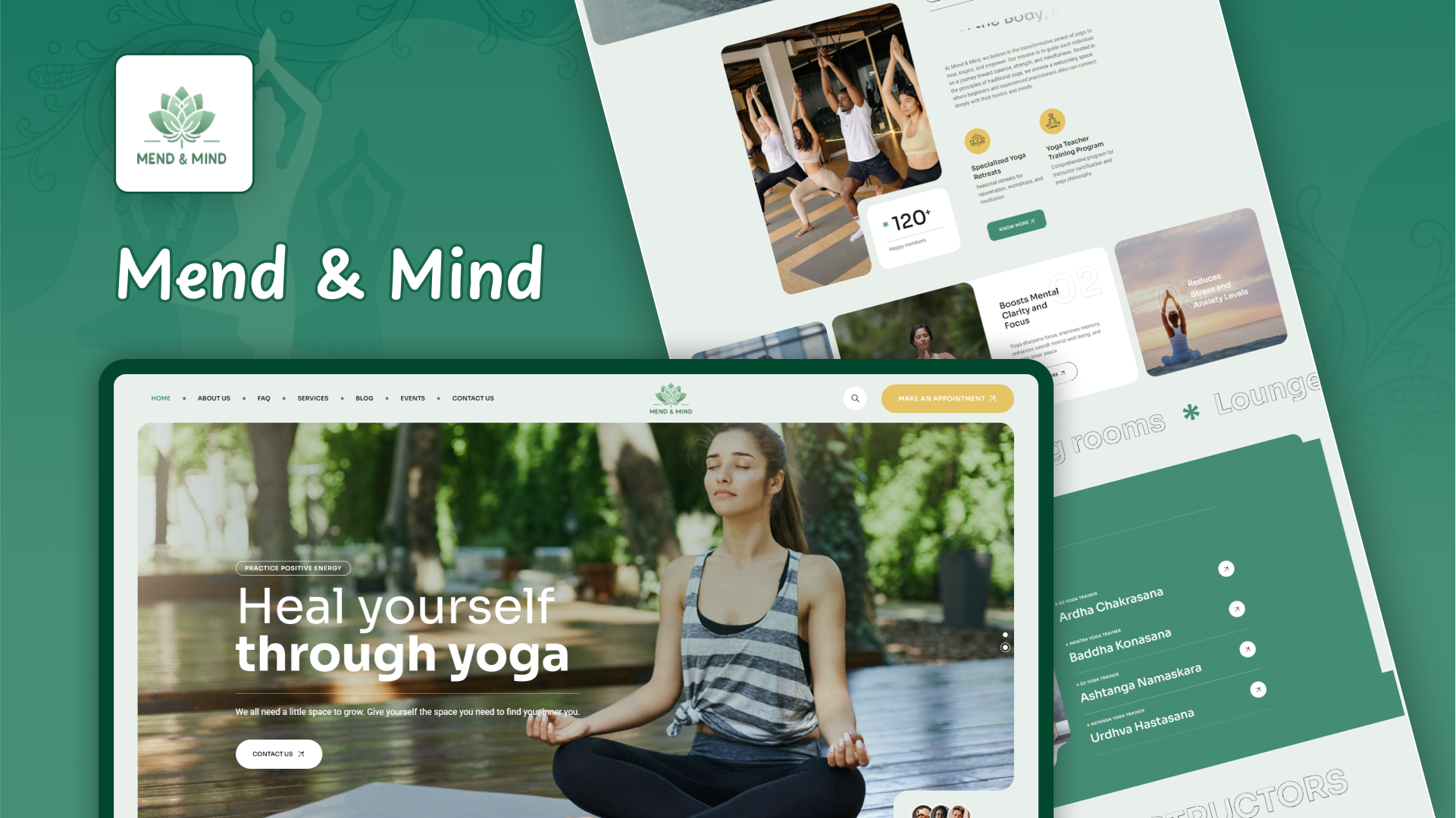
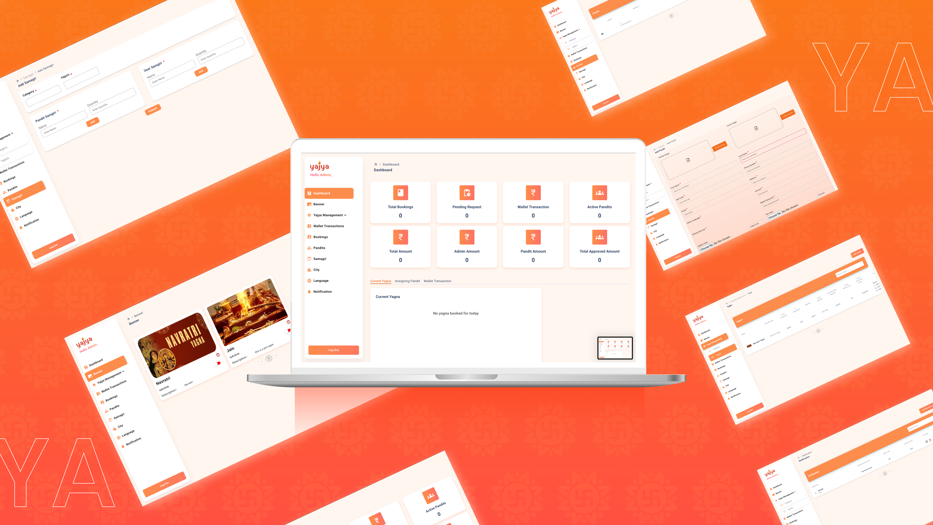




CSS, or Cascading Style Sheets, is a language used to define the presentation of web pages written in HTML or XML. It controls the visual aspects of a web page, such as layout, colors, fonts, and spacing.
CSS is essential for separating content from design, making it easier to manage and update the look of a website. It also ensures a consistent appearance across different devices and screen sizes, enhancing the user experience.
CSS can be applied in three ways: inline styles within HTML tags, internal styles within a <style> block in the HTML document’s <head>, and external styles via a separate .css file linked to the HTML document.
Class selectors (e.g., .classname) are used to style multiple elements with the same class, while ID selectors (e.g., #idname) target a unique element with a specific ID. IDs are meant to be unique within a page, whereas classes can be reused.
Media queries are a CSS feature that allows you to apply different styles based on the device’s characteristics, such as screen size or orientation. They are crucial for creating responsive designs that adapt to various devices.
The CSS box model describes how elements are structured and spaced on a page. It includes the content area, padding, border, and margin, which determine the element's size and positioning.
Elements can be centered using various techniques. Block-level elements can be centered with margin: auto, inline elements can be centered with text-align: center, and Flexbox or Grid can be used for more complex layouts.
Flexbox is a layout module in CSS that provides an efficient way to align and distribute space among items in a container. It simplifies the creation of flexible and responsive layouts.
CSS Grid is a powerful layout system that allows for the design of complex, two-dimensional grid-based layouts with rows and columns. It provides more control over element placement and alignment compared to traditional layout methods.
To improve CSS performance, consider minifying and compressing CSS files, using shorthand properties, reducing redundancy, and leveraging browser caching. Combining multiple CSS files can also reduce the number of HTTP requests, enhancing load times.